link::Script of the commands used in the post
What is Data?
We begin with the question what is data?
As most popular site shout “Data are are values of qualitative or quantitative variables ,belonging to the set of variables.”
Set of items: Here set of items is referred to as Population. Data Analysis actually involves studying a subset or SAMPLE of entire Population.

The above diagram clearly show the relation between Sample and Population.
Data Analysis should always begin with the question like ‘What percentage of Indian population is as tall as 6 feet?’
Inference:The purpose of analyzing sample id to draw conclusion for the entire population and this is called Inference.The primary goal of Inference Statistics.
Purpose:To find the inference of the population.And to do so we need to describe the sample.This is the primary goal of Descriptive Statistics
Central Tendency:You are given a set of data like data of cars with price or mpg .You are asked to tell a number to represent the whole data set.
Hmmm…..
Thinking what will you do.Most probably you will be finding the central number ,middle number or the most common number.Right?
These are called Central Tendency.Easy no?
From Statistics point of view there are many methods to represent Central Tendency.
Central Number::Mean
Middle Number:: Median
Common Number:: Mode
In this post we’ll be using R to work with data and build models.
But what is R?
R is a software environment for data analysis, statistical computing, and graphics.It is also a programming language which is natural to use and allows you to complete data analyses in just a few lines.
However, if you would like to try a graphical user interface, or GUI, there are many choices. Two popular choices are RStudio and Rattle.
Prerequisites: Please download and install R for free from the following webpage:
http://www.cran.r-project.org/
The Central Tendency in R
Data Set :cars( R has many in built data sets and mtcars is one of those)

There are many characterstics or columns in the ‘cars’ data frame.Here we are only interested in ‘mpgCity’.

So we extract it new variable ‘myMPG’

Now time for Central Tendency:
1.Mean

2.Median


The mode is 19 (Table gives the frequency of each value in myMPG and highest frequency value is MODE)
Basic Analysis(I):
Data Set:Download WHO.csv. this data set come from Global Health Observatory Data Repository.
See the file type ,its CSV. CSV(Comma Separated Values) file is a common format for data files and is easy to work with in R
Step1:
Load the file from its location ,as mine WHO.csv is present in the present working directory so directly loaded the file from its name ,otherwise you need to give the full path.
>read.csv(“full path of file”)->used to load the file in R

Step: Having loaded the file in R ,we have two commands two look at the data
(i)str-> shows the structure of the data
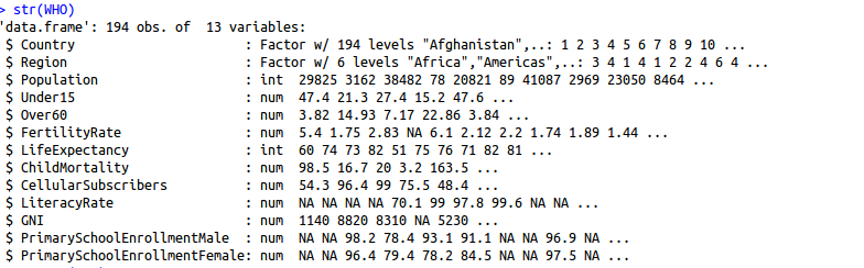
1.The variables are the name of the country, the region the country is in, the population in thousands, the percentage of the population under 15 and over 60,
2.The fertility rate or average number of children per woman, the life expectancy in years, the child mortality rate which is the number of children who die by age five per 1,000 births, the number of cellular subscribers per 100 population, the literacy rate among adults aged greater than or equal to 15, the gross national income per capita
3.For each variable, str gives us the name of the variable, and then a description of the type of the variable followed by a first few values of the variable.
We see a couple different types here. One is a factor variable. Country and Region are both factor variables. This means that the variables have several different categories, not necessarily numerical.Then we have two types of numerical values— integer and then general numerical values.
(ii)summary->gives numerical summary of each of our variables.
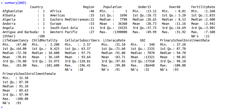
- For the factor variables, country and region, it counts the number of observations in each of the levels or categories
- For each of the numerical values, we see the min, first quartile, median, mean, third quartile, and maximum values in that variable.
It is always useful to subset data.In R we can do this by using command subset.
We take subset WHO dataframe to create new data using only the Europe population.
We can do that as follwing.
Lets see the structure of the newly created data frame.
 Now let we find summary of WHO_Europe data frame.

As we have done reading and working with the data files and finally we should see how to write back the files in R.

Now its time to explore WHO data set.
Lets start Basic Data Analysis.
BASIC DATA ANALYSIS(II)
We are using already downloaded WHO data set.
Getting Started:
To access a variable in a data frame you always have to link it to the data frame it belongs to with the dollar sign($).

Thats the output of data frame vector Under15.
Now we try some basic functions like mean,standard deviation in R.
1.Mean

2.Standard Deviation.To do this we have command sd in R . See in the image how to use it.

3.Summary: We can get the statistcal summary by typing the summary command WHO$Under15 within parenthesis.
Notice this time summary is quite different from the summary of whole data set we have earlier applied.
 This gives the minimum value, the first quartile, the median value, the mean, the third quartile, and the maximum value of the variable Under15.
First quartile: It is the value for which 25% of the data is less than that value.
Third quartile: It is the value for which 75% of the data is less than that value.
Note:This output tells us that there’s a country with only 13% of the population under 15.
4.Min ,Max and which: Let’s see which country it is using the which.min function.

Hey this is Japan with Under15 population 13%.
We can do the same with max function to see which country has maximum Under15 population.

It Niger ,the country with maximum Under15 population.
We can also see the basic commands for plotting in R
5.Scattered Plot:We now create a scatter plot of GNI versus fertility rate.
> # Scatterplot
> plot(WHO$GNI, WHO$FertilityRate)
>

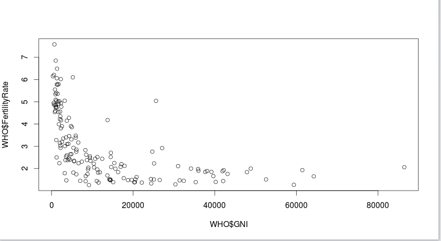
In the above Scatter you could see :
- Income, or GNI, is on the x-axis,
- and fertility rate is on the y-axis.
Each point in the scatter plot is a country We can see that most countries here either have a low GNI or a high GNI but a low fertility rate.
However, there are a few countries for which both the GNI and the fertility rate are high.
Lets see whats wrong there.Why is such a diiference.
Go through the the plot .Notice that the enexpected result is with a GNI greater than 10,000, and a fertility rate greater than 2.5.
So now we shoud use subset function to extract it from rest of the data.
> # Subsetting
> Outliers = subset(WHO, GNI > 10000 & FertilityRate > 2.5)
We can see how many rows of data are in our subset by using the nrow function.
> nrow(Outliers)
[1] 7
Output of nrow tells us that there are seven countries for which the GNI is greater than 10,000 and the fertility rate is greater than 2.5.
Now to see the values of these three variables for the seven observations of Outliers.
> Outliers[c("Country","GNI","FertilityRate")]
              Country   GNI FertilityRate
23           Botswana 14550          2.71
56  Equatorial Guinea 25620          5.04
63              Gabon 13740          4.18
83             Israel 27110          2.92
88         Kazakhstan 11250          2.52
131            Panama 14510          2.52
150      Saudi Arabia 24700          2.76
>
We can see that one of the seven countries is Equatorial Guinea, a country that is very rich per capita due to oil production, but the wealth is distributed very unevenly.
In addition to scatter plot.We can create several other plots in R. Like Histogram or Boxplot.
Histogram:
A histogram is useful for understanding the distribution of a variable.
create a histogram of CellularSubscribers.
> # Histograms
> hist(WHO$CellularSubscribers)
>
 Here we can see that the most frequent value of CellularSubscribers is around 100.
2.Boxplot:
A box plot is useful for understanding the statistical range of a variable.
 # Boxplot
> boxplot(WHO$LifeExpectancy ~ WHO$Region)

This box plot shows how life expectancy in countries varies according to the region the country is in.
The box for each region shows the range between the first and third quartiles with the middle line marking the median value.
The dashed lines at the top and bottom of the box, often called whiskers, show the range from the minimum to maximum values, excluding any outliers, which are plotted as circles.
Inter-quartile range: the difference between the first and third quartiles, or the height of the box.
What is an outlier?
Any point that is greater than the third quartile plus the inter-quartile range, or any point that is less than the first quartile minus the inter-quartile rangeis considered an outlier.
This box plot shows us that Europe has the highest median life expectancy, the Americas has the smallest inter-quartile range, and the eastern Mediterranean region has the highest overall range of life expectancy values.
Huh….We have done enough Analysis .
For more Analysis wait for the next post.

One thought on “Basics Of Data Analysis”
1 Pingback